TABLE OF CONTENTS
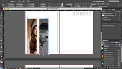
By clicking on the following images, you will be able to observe the process of creating Detailed's table of contents, and all the changes done throughout it,such as the position of the text and images, fonts used...
The final version is presented below these images, with its respective explanation.
 |  |  |  |
|---|---|---|---|
 |  |  |  |
 |  |  |  |
 |  |  |  |
 |  |  |  |
 |  |  |  |
 |  |  |  |
 |
FINAL VERSION


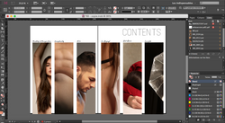
PHOTOGRAPHS :
The selection of photographs, ended up being easier than we expected, because we had a clear perspective of the type of pictures we wanted to include and how to position them.
During the planning of the table of contents, we knew we wanted the images to be put in a rectangular shape as a way of teasing minimally the content of each section, representing our style. We decided for the images to be all the same size when having in mind the way it would look if the magazine would be printed, we believed would be more visually pleasing.
We tried various pictures from each respective editorial but decided to choose ones with less saturated colours and more skin tones in order for them to match and keep the the colour scheme balanced.
As observable, the pictures can be hard to unravel. We wanted it to be this way in order to catch the readers attention and create intrigue and interest to find out what they represent and increase the relevance of the table of contents. Which in many magazines is considered as a boring and minor aspect.
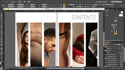
TEXT :
As you can see the text isn't the most noticeable element in this page, we followed similar the conventions of fashion magazines like Nude.
We tried various different sizes and positions as well as fonts, we ended up choosing the most discreet and subtle, by choosing a smaller size than expected and a hand-written font. The decision to put the titles sideways to the images was based on the idea of emphasising the photographs and then relating them to their titles.
The font used for the folio matches the one of the contents title, given that we wanted the page to be symmetrical and organised rather than mismatching.
Moreover, when taking into account the possibility of printing the magazine.
We thought that by arranging the images this way,leaving them distanced but in subsequence, would look better and in this way the spine of the magazine wouldn't disturb the viewing of the pictures.
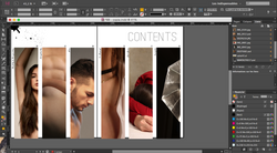
ICONS + QR CODE:
Meanwhile working on the table of contents and after having decided upon the final look of the images together with the text,we realised that the pages were incomplete.
We were aware of the conventional use of icons as a representation of social networks, and knew it was a vital aspect in most magazines nowadays especially ones based in an online platform, that is why we decided to use them.
The QR code, on the other hand wasn't in our initial plans. Since the inception, we wanted something more 'artistic' and less structural but none of the figures we had in mind such as flowers, paint stains etc, worked.
So we opted for something more strategic, that would benefit the distribution process of the magazine and would match the positioning of the social media icons.