top of page
WEBSITES

s
website repsects most conventions, altough in a very minimal way - which as you will be able to notice in the rest of the examples is becoming a characteristic of most contemporary artists.
The artists name is positioned at the top of the page - but it is not fixed. The main noticeable element in the main page is the promotion of her latest album "As she pleases" together with the links to the various listening platforms its available on. Below this we are able to find the artists social media accounts, shown with the conventional logos, as well as the newsletter subscription box through which the audience has the option to sign up.
An unconventional aspect is the lack of a search engine in the website, which is often considered as vital but the simplicty and arragement of this website may explain this subvertion.
each assigned in its respective/separated page
INCLUDES
tour dates
biography
news regarding the artist
music released
recent photos (professional) of the artist
promotional merch
contact information (completion)
the menu bar which includes the tab to each page is fixed/pinned to the screen


This website in many ways represnts clearly the minimal aesthetics I'm trying to achieve, by respecting conventions but following their own specific style and using a clear promotional organisation.
The groups name is positioned in the top left corner of the page, sized slightly bigger than the rest of the text found in the home page. Another unusual aspect is the lack of a search tool, which could be seen as a tactical and reasonal choice given the clarity and functionality of the site.
The main feature in this case is the music video promoted, shown through the central positiong of a labelled box, uncommon when compared to other artists websites (in which they focus on their latest album sometimes accompanied by their corresponding videos). Aditionally their social media, represented through the usual logos is found in the central bottom of the page, signalised by an arrow.
INCLUDES
tour dates - LIVE
music released
contact information (completion)
the menu bar which includes the tab to each page is not fixed/pinned to the screen
each assigned in its respective/separated page


website when compared to the previous examples is the most conventional and common one in the contemporary music industry. It has a clear, minimal but promotional structure along the style of the artist which respects the characterisicts associated with the music genre.
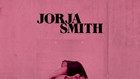
The artists name is positioned vertically/sideways in the left side of a photograph of the artist from her latest music video, still attracting attention but not being the main element. Its font and sizing is equal to the rest of the text present in the main page.
In this case the main focus is in the promotion of the artists latest song together with its respective music video, positioned under Jorja Smith's social media pages (represented through the common logos) and above the pages menu.
s
INCLUDES
tour dates
music released - LISTEN
merchandise - STORE
each assigned in its respective/separated page
the menu bar which includes the tab to each page is not fixed/pinned to the screen -
positioned in the bottom of the page rather than the top - subvertion of convention
an aspect which is different from most official artists websites, is the ridirection when clicking on the menu tabs, instead of the current page changing it opens a new and separate window for each tab. This altough being more a technical feature could be considered as decision based on advertisment, facilitating the audience to parallely explore all te pages.

BY CLICKING ON EITHER THE ARTISTS NAME OR THE MAIN WEBSITE IMAGE YOU WILL BE REDIRECTED TO THEIR RESPCTIVE SITE.
LEGEND
aspects i would like
to adopt/recreate
ASPECTS I WON'T ADOPT
bottom of page


